Desktop CSS Media queries is missing?
Not if you ask the guy in the picture 😂
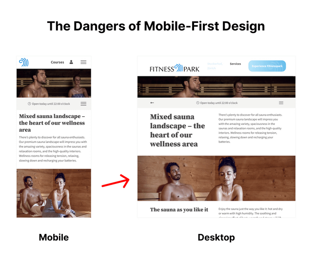
I just explained my wife “mobile first”. So I showed her the website on my mobile and then on my iPad. Her stoic reaction: “How stupid!” 😂
I‘ve never agreed with the premise of ‘mobile first’ — it makes much more sense to design for the richest environment and then work back down to mobile. I suspect that it came from the belief that users would primarily use the web on their phones. For most of us, though, browsing on a laptop or tablet is a much more comfortable experience, and we use our phones only when stuck outside in the rain trying to call an Uber. Of course there is a group of people who only have mobiles — I know some — but they tend to use the web in a different way. That’s best catered for by considering the mobile experience separately. I don‘t believe, though, that using the web on a phone will ever be a nice experience.
Me too.
This made no sense and was nothing but a confusing marketing distraction as we moved into the responsive world.
It should be design for laptop and then adapt for every single pixel width down to 320px wide and test, test and test. In the RW world we have everything we need but there are still too many compromising ways to buid a site wit RW.