I’m trying to learn Sections Pro by re-creating the example pages in Foundry as I don’t have Foundation. I’m only doing things I know I need for builds at the moment. The one I’m interested in is this one: http://sectionspro.bigwhiteduck.com/learn-sections/prop-width/
Because Foundry doesn’t have an ‘equalise height’ stack I’m having difficulty getting it to work. My version looks like this
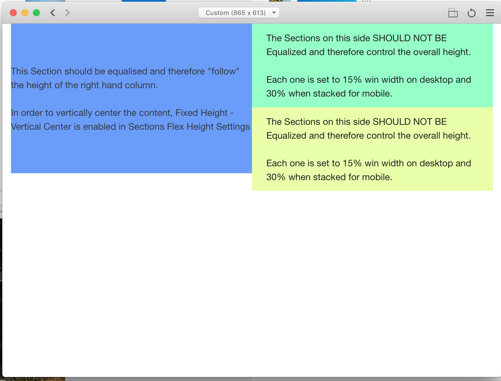
AS you can see, the columns aren’t ‘equalising’. I’ve turned of the ‘Foundation Equalizer’ option and now I cannot get it to work no matter what I try. Setting the height to 60% browser width (as the other sections are set to 15) only works for so long then it breaks (something to so with auto content?).
So, is this even possible in Foundry? I’m attaching the RW project file and its on the first page. If someone could have a look I’d be very grateful.
Foundry does support equal height columns, look in the Advanced group at the bottom of the Column stack settings. You can then just turn on the background for column 1 (in the example above) and do away with the section in that column.
The two sections on the right will therefore dictate the height and the left column (1) will stay at the same height.
The only limitation here is that the equal height Foundry columns only support simple colours and not gradients or images. In that case, you could use a SectionsPro as per the original example but use an advanced positioning child to make it follow the height of the (equalised) column - lets not get ahead of ourselves at this stage though and over confuse things.
Thanks @tav. I had already tried turning on equal height columns but it didn’t work for me. In fact it has never worked for me in Foundry… I’ll try it again now following your instructions to the letter.
Hmm. So that partially worked but as soon as I shrink the page down to mobile size the first column vanishes… Also, I will need to add images to the column background as the site I will be rebuilding is this one:
When columns stack, the equal height feature is cancelled. If there is no content then it will collapse to zero height.
BluePrint sidebar makes a great equal height column solution as well. It uses the same background and overly stacks as Sections so it’s easy to integrate.
Remember with equal heights, unless there is a background or border you will not see the equalised size.
Scroll down below the main header image and there is a section with image one side and text the other, there are two rows like this with the image on opposite sides. I’ve used Sidebar to do this.
I have the images set to hide on mobile, but you can set them to be above or below the text.
I’ve also got a bit of animation using BWD’s Scrollmate.
@steveb Nice website! Yeah, that’s pretty much what I’m trying to do. I think Sidebar will be perfect.
Thanks for the help. Just out of interest, I watched your little video about adding Barbers to the barber site and it looked very ‘wordpressy’. Is it Wordpress you’ve used or one of the CMS’s that work with Rapidweaver? I’d be interested in setting up a cms that can do this kind of thing for one of my sites. I’m not a fan of wordpress though.
Whatever it is your talking about, it’s not WP, I don’t use it. I’m not entirely sure what you are referring to though. Do you mean the booking system?
Gotcha. Those videos all relate to the booking system, which is nothing to do with Rapidweaver. It’s a php script that I’ve had customised to suit. It can be added to any website made with any framework. So RW, WP, hand coded, etc.
A lot of RW users seem to think that only things “made for Rapidweaver” can be used on a RW site, ie. Stacks. But there is a world of scripts etc. Out there that can be added to any website.
So… Further to this setup I’m using Sidebar and it works perfectly, so thanks @tav for that! How though can I address the collapsing image issue when it stacks… Is there some trick-of-the-trade to keep the background ‘overlay’ image in the ‘Aside’ column visible when it stacks. I tried a transparent border but it can be seen as negative space. Perhaps invisible content? Transparent png??
Just FYI, I’m using UIKit framework and to make sidebar bg’s work at all you have to set the z-index to 0 in the options. Took me a while to work that one out!
When it stacks it is no longer equal height (it cannot be as there is nothing along side it). The aside therefore behaves like any other element and assumes the height of its content. Because you have no content then it has no height. A background image cannot give a container height, rather the container is what scales the image.
The solution is simple and is to just put some bottom padding on an element to give the container some height.
You will want to do this responsively so that the padding only appears below your breakpoint (i.e. when it stacks). If you make the padding a percentage based one then you can control the aspect ratio of the container - e.g. if you make it 56.25% then you will get a 16:9 container for your background image (9 / 16 * 100 = 56.25)
You can achieve this with a BluePrint ONE stack (or any other container that supports % padding and breakpoint control) or just with a bit of CSS on the aside if you prefer.
not at the moment. Its a two column setup with equal height columns, one with an image covering the whole column, one with text on one side. Looks great until it stacks…
Perfect! Thanks @tav Nicely explained too so I learned something useful today! The more I use Stacks in RW and all its extras, the more I can feel my brain stretching!!
As Tav above said, it’s a background, so without any content to give the section some depth, and no column to its side to dictate the height, it collapses to nothing. So again as Tav sid, stick in a stack with some padding top or bottom to the height you want the image to be when it stacks.
An alt way, that I tend to favour, is to have the image as a background when it is in column move, but hidden when it stacks. Then, add an image stack with the same image (must be the same, from the same source, else you’ll add page weight for no reason) that is hidden when the background image appears then appears when the sidebar stacks.