Variable Font subsetting

Has anyone had any success using the subsetting tools inside the Font Squirrel webfont generator?

I have tried a few v-fonts but in each case the resulting woff2 fonts were either converted to non v-fonts or there were obvious errors in the subsetted woff2’s such as the image below where the A and Q are not correct:

Screenshot 3

I have spent enough time trying to use Font Squirrel to come to the conclusion that it doesn’t work well enough for subsetting, to be used.

However, in the background over the last week or so I have been trying to use Fontools pyftsubset and today I finally got this to work. I am not familiar with using Python and this has been a long journey of Googling and Stack Exchange searching to find out how to overcome all of the dependancies and error messages to solve for a successful installation.

I successfully reduced a 768Kb variable font with weight 100-900 and both normal and italic, down to 42Kb by removing what I didn’t need.

1 Like

What I had heard in the type design forums is that Font Squirrel couldn’t be used for subsetting variable fonts — it converts them back into static fonts. However Font Squirrel may in the meantime have tweaked their code. But it sounds from your experience that it still doesn‘t work?

There are two command line applications — of which pyftsubset is one — which can do the job. The heavyweight font editors (Glyphs, FontLab, Robofont and the open source FontForge) also allow for subsets to be made. I don’t know too much about the others, but Glyphs allows you to do it with a python macro on export (python is the equivalent of javascript for type designers, which I guess is unsurprising since its creator, Guido van Rossum, is the brother of designer and early PostScript font pioneer Just van Rossum).

Dynamic subsetting, where the browser downloads just those parts of the font it needs, will be the way to go, once some standards emerge (because we never know when someone is going to want to refer to Jarosław Zieliński, Hồ Chí Minh or Þuríður Backman). But at the moment, for most purposes, stripping the font down to ISO Latin 1 (ISO 8859-1) will do what we need it to do, and significantly reduce its size.

Once you figure out Fonttools pyftsubset, it doesn’t take long to download a selection of Google Variable fonts and subset them them down to silly small sizes.

Not only does this bring gains in downloading less and smaller font files, the abillity to fine tune the weights, but it allows a much quicker and far easier process to change all the fonts in a web site by changing one warehoused font file.

Up until now the process was a long one that for most users, involves selecting a Google font family, downloading it and then going through the process of converting each ttf font into a woff file for every weight you think you may want. Still not sure why Google don’t provide fonts in woff format but that’s just how it is. Then each weight needs configuring to load each distinct file. To try a different font family, requires going through that process for every font. With a single small variable font file, you can replace 1 file on a server and instantly see the changes in a live site, of a different font across all weights used.

I have noticed that by subsetting a variable font by reducing to the latin upper and lower case and punctuation characters, reduces the full variable ttf file down to around 22Kb for both the weight axis and slant axis font versions, i.e. 2 woff2 files. Reducing variabe fonts with both weight and slant, reduces down to about 45Kb, i.e. 1 woff2 file. So whether a variable font is available as seperate weight and also italic versions or a combined version, the overall sizes are about the same.

My observation is that the more axes there are in a variabe font, the larger the font is by roughly 25Kb per axis. E.g. The Recursive font is 2.1Mb in ttf and reduces down to 221Kb in subsetted woff2. Using such a font in a web site would make little sense, but variable fonts with just weight and slant axes make great sense.

Each axis requires at least two masters, which is effectively the same as two normal fonts. So a variable font with just a weight axis contains the lightest and heaviest fonts to interpolate between. Since interpolation doesn’t always produce the right results in the middle — which is where there will be most use for the font — there might well be a third master or fourth master to control this. And each additional axis doubles the number of masters, so a two axis font needs at least four masters, a three axis font at least eight, four axes sixteen, etc.

My rule of thumb is that variable fonts make sense if the number of masters they have is equal to or less than the number of font instances we use. So, if we have a site where we’re using regular and bold weights, there won’t be much difference in downloads between a single-axis variable font and two static fonts. Of course the variable font is a single download, and it gives us the opportunity to do more than use two weights. Maybe we could make our menu bars slightly less bold, and our subheadings slightly more? Maybe that bigger intro text looks better lighter? Etc.

For me, a two axis variable font makes the most sense. For those who use two different ‘paired’ font families, which is a common choice these days — for instance a sans-serif and a serif — a single variable font (like Arizona) could provide both. Even so, it might make more sense to do this with two different single axis variable fonts than one two axis variable font, unless you fancy using the interpolations between them. This is the issue with italics, too — if you don’t see yourself using the ‘betweens’ (which are a bit odd between roman and italic), there is no need for these to be on a variable axis.

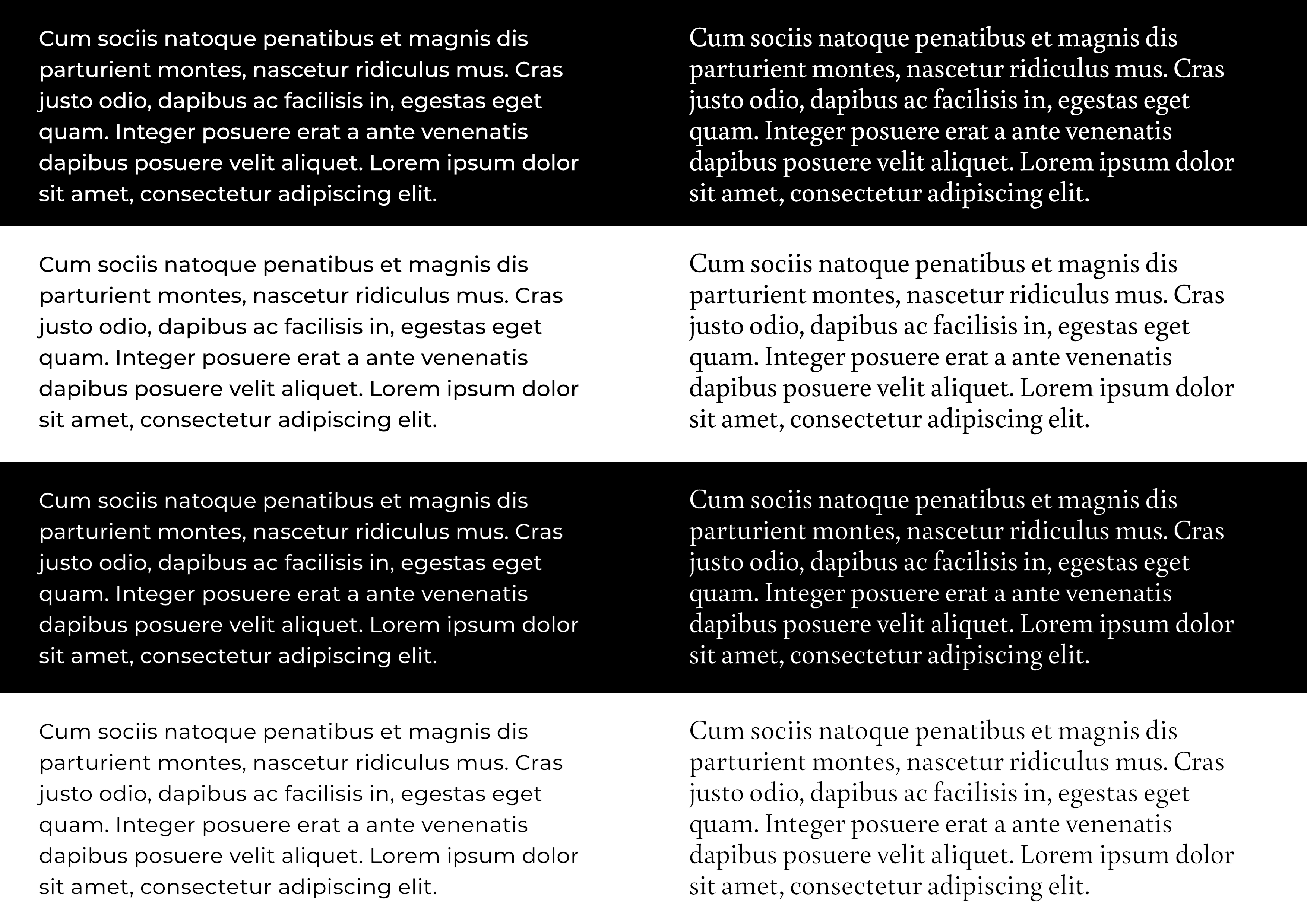
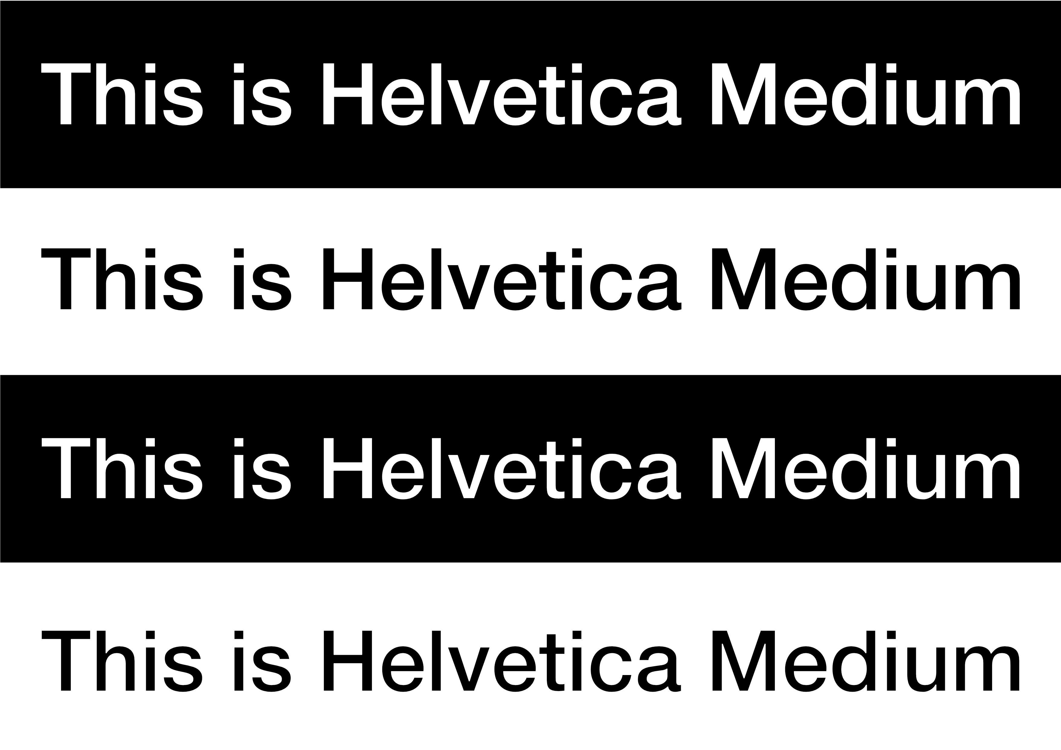
The variations which I find make most sense are weight (‘wght’) and optical size (‘opsz’). That lets us tweak text on mobile, for instance, so that it is a little bolder and there is less contrast between thick and thin strokes (much improving its legibility and readibility) but it also lets us make our bigger sizes — titles, headings, headlines, subheads and intro text — more elegant and less clunky. More like the ‘display’ type they beg to be.

And there are some good examples of fonts with these two axes out there. Owen Earl’s Bodoni* is a great reworking of a classic type which has long been problematic to use in print because either the thin strokes disappear in text, making it dazzle, or they have been beefed up and look ‘Janet and John’ in bigger sizes. Earl’s version goes from a true hairline in 144px to something eminently readable at 12px. Huerta’s ‘Piazolla’ is a nice contemporary design which does the same thing, from the people who brought us ‘Alegreya’ (which is also in a single axis variable now).

https://indestructibletype.com/Bodoni.html

2 Likes

I have found that reducing the weight of light text on a dark background by 50 matches up the visual descrepancy we often see between that and dark text on a light background.

Interesting you mention that — I’d seen an article about it the other day. Type company Dalton Maag, who are just down the road from me, apparently have a special axis to do just this. I had a boss in the 1980s who, on my first day, gave me a bromide (God, I feel old saying that!) on my first day with four lines of type on it. They all said ‘This is Helvetica Medium’ and were set in… Helvetica Medium (in those days on a Photo Typositor). The first line was reversed white against black, the second black on white. And the first line looked considerably bolder. Underneath there was a pair where the top line had been redrawn to make it optically consistent when it was reversed, and it looked the same weight as the positive line above. The bottom line showed the slimmed version in positive, and it seemed much lighter.

That’s a long and complicated explanation, but the bromide made a lasting point (I may even still have it somewhere). Type reversed out of a dark colour will always look bolder than the same weight in a dark colour on a light background. It didn’t change my opinion of Helvetica Medium, though… !

(Here’s an attempt to reproduce it) Helvetica|690x487

I guess, this illusion is a matter of individual sight characteristic. In your sample linked above, I do not see white text on black background as either more or less bold than the other way around. They look identical to me. Perhaps that is because of a big size of letters.

In my family website where the text is considerably smaller (16px), I am witnessing the opposite illusion to what you’ve described, e.g. white text on dark background looks to me thinner than the one—set with the same font and same width—black on white background.

This has been bothering me so much, that I started using ‘regular’ thickness instead of ‘light’ one – for white text on black background. Now, it looks almost good, in my eyes (just slightly too thick).

Here’s a similar test-sheet for text — in this case with a sans-serif font (Montserrat) on the left and a serif font (Buenard) on the right. As before, the first pair (top, black; second, white) are the same weight of type (medium for Montserrat, regular for Buenard). The third panel down on each side shows the reversed type stroked with the background colour to make it appear the same optical weight as the example in the panel above (so 2 and 3 should look the same weight), And the bottom panel shows the same stroke applied to the fonts in ‘positive’ (black on white) to show how much lighter it is than panel 2.

The issue that I see on web sites with light text on dark BG compared to dark text on a light BG, is down to the type of browser and also the monitor that is displaying the page. Other factors may also be involved but the bottom line for me is that light text looks heavier than the equivalent light colour paragraph text for some fonts.

I have been doing some experimenting with my Webdeersign site and I have currently set the main paragraph dark text to a weight of 340 and the light text to a weight of 310. On a decent monitor or an iPhone, to my eyes the dark and light paragraph text look equal in perceived weight. (I’m still testing so this may change).

However, on a 10 year old Win10 PC with a typical poor monitor, both text weights look too thin for my liking, in both Edge in Chrome. In my case this is not important becasue my site is aimed at Mac users.

One of the best features of using variable fonts is that you can have this granular level of control instead of having to choose between 300, 400 or 500 and also have to prepare and load up those fonts.

Most of the differences that are observed are due to the degree of astigmatism in one’s vision. That is also why people of middle age and above struggle more with white text on dark backgrounds.

1 Like

Interestingly, though, this is something that carries over from print to digital media. Compensating for the emboldening effect of reversing white out of black was something we used to routinely do in physical media — back in the 80s we were creating slimmed down ‘negative use’ versions of logos, for instance (and also ‘small use’, with the same kinds of adjustments type designers make in ‘caption’ variants of fonts). If anything it is intensified on the screen, because white is 100% of Red, Green and Blue — so a bright light against an inert dark background — and there is a halo effect just from this as well.

In physical media a ‘negative use‘ version of a font would be slimmed vertically as well as horizontally — we used to achieve this with an inline (as opposed to an outline — a ‘stroke’ within the boundaries of a glyph). To achieve the same effect with a variable font, it would be a matter of both decreasing both the weight and size — which is fortunately easily done. Overall the slimming needs to be somewhere in the range of 10-20% of the width of the vertical stems at text sizes, depending on the font and the context (contrast of colours, screen etc.).

My young eyed testers see the difference but what do they know anyway after looking at the awful TikTok logo for so long.

It’s a thing — and it’s not new. This is an interesting take on it: Dalton Maag‘s ‘Darkmode’ vf, where they pioneered the idea of a discrete ‘darkmode’ axis. (And their animated demos are much funkier than mine!)

https://www.daltonmaag.com/library/darkmode

1 Like