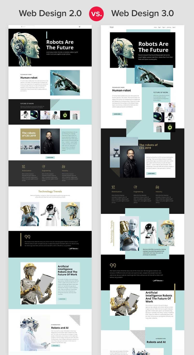
Here is an interesting page that should stimulate anyone building web sites wanting to make their sites look up to date. It is obviously promoting Niceweb as the tool to build these sites, but the main image below is a clear illustration of the new overlapping world we live in.
This will be very familiar to Source users who use the Grid Plus.
Except that if you review the top 10 web design houses world wide, plus the top 5 UK ones you will find that none of them use overlapping content. They have all moved on to brutalism with white space around square blocks.
I don’t like it either - just saying that is where the design trend is now.
Just for the record - I think the Web 3.0 example on that page is bloody awful as well - cluttered, hard to read and done for the sake of it rather than for design reasons.
Overlapping content is just confusing and not at all how I consume the websites I use the most. The ones that look the best to me are the ‘brutalist’ ones with acres of white space. I have even stopped using Apple’s Dark Mode. If you pick up a book, or magazine to read, rather than just to flick through, they are all dark text on a white background. The more whitespace there is, the easier the reading experience. I looked at the image above and realised that I preferred Web Design 2.0, with 3.0 just being too cluttered.
I think dark mode is largely a computer nerd thing. It is interesting that we spent years waiting for good full colour monitors so that we could easily read dark text on a true white background instead of green on dark green or orange plasma. Now we have them, we change them to be harder to read by using dark mode just because some geeks in deck shoes on a stage in California tell us its “cool”. I’ve heard every possible unproven justification regarding eye strain and working at night, all of which contradict medical and ophthalmological evidence to the contrary. Needless to say, I do not use dark mode but I do like ranting about it :)
The web 2 vs Web 3 image is more about illustrating the differences of the 2 layout approaches, than creating a good layout in itself. As always, good design is about the white spaces.
Dark Mode is very much an Apple nerdy thing. Hell, even Win95 had what would be considered a Dark Mode and many options of it, too.
Two weeks ago, I’d’ve agreed with you. I hated the look. But my (US) client wants a site that will look like the big marketing/design companies he’s targeting with his video production services. So @sa3305 and I did the research @tav alluded to above and we couldn’t escape the conclusion that brutalism was the way to go.
It took me about four days to build a homepage mockup. That was my learning curve. Then before showing it to my client, I had to set the mood, light the scented candles… and it then took me an hour to show him the results of my research and lead him slowly from the comfort of his currently soft and warm site to the hard-edged brutality of a cold new world. Inwardly, I was shiteing myself that he would hate it and that I’d have to start all over again.
But he didn’t. He embraced it wholeheartedly.
And the funny thing is that while building the mockup I fell in love with the brutalist style.
It was and is a truly liberating form of design. It frees you from all the embellishments we like to call design, and yet while it still has some harsh structural constraints, there’s still plenty of room for all the bells and whistles we cannot live without.
That’s good to know and I would love to see it. Get the right scented candles going early and your 99% there.
Your client make have loved it, but what did his 176 tigers think of it?
These labels though are often very loose in some ways and there is an overlap of design ideas, styles, trends, or whatever the label is. A boldly coloured large text Bootstrap site with some negative margins content could easily be described as traditional, brutalist, overlapped, broken grid. The bottom line is that if your client buys into it then, it’s exactly the right design. Not many clients could even communicate the style they want and if they do, then that’s what they must be give.
The image I posted at the top is a rare example of 2 design styles side by side and if you examine each Bootstrap band and then examine the broken grid or overlapped version, as you break the design down, you can see how an alternative approach might look. Most RW users would not know where to start on achieving this effect anyway. It is way overdone in the image and also is not done by someone who fully understands how to achieve the full effect or lacks the skill to make it work.
When an overlapping or broken grid layout is done well, it can have the benefit of fitting more content into the same height as a Bootstrap layout. The typical 3 column with a gutter and padding in each column, image at top and text underneath, is very wasteful of space and when it collapses to 1 long column, it gets even more wasteful of space. By overlapping images a bit, running headers across a page into an image, etc, you can end with a peasant to look at efficient layout. The benefits are increased as the layout needs to collapse because the 3 collapsing to 1 restriction are removed. So that is a genuine advantage such a layout I would say.
So is that “brutalism”? Just looks like good design to me, apart from the huge fonts ;-)
It strikes me all this web2, web3, Brutalism is just nonsense branding. Saw it in the bike trade when I had the shop. A “racer” became a road bike, became an endurance bike, became a sportive bike, become a etc. All the same thing, just a new “brand” name every year or so to encourage the terminally stupid to buy a new bike.
I’ve had the same “road bike for years”. It started as a tourer. Then became a CX, yesterday, I went out on the tourer, only I didn’t, as it’s now a gravel bike.