Tidy
1 Like
Oh?
Oh?
Oh?
Oh?
Oh?
Oh?
OH!
1 Like
Oh, how I’ve loved this thread. And no, that isn’t sarcasm.
1 Like
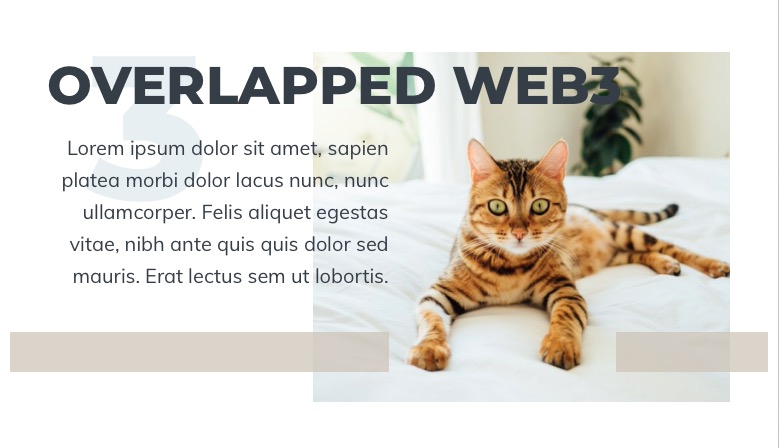
Here is a demo of what an overlapped layout is using Source. Note how the areas of the first layout respond with various adjustments down to 320px. The height of tehe overlapped version is much less for medium sized devices below 768px.
The 2nd layout is an equivalent Bootstrap, or dare I say Web 2.0 layout would be text on the left inside an area bounded the 50% column split.
2 Likes
One words…
Blueprint.
(This is not news! BP has had an overlap feature for years. Feck… Even Foundry has a stack for it!).
2 Likes
I would love to see that layout built with Blueprint or any stack solution. In fact I don’t think there is any way to build that layout except with Source, using RW, but would love to be proved wrong. As always the Devil looms large in the details of tight layout. All positioning is done with the Source Grid Plus settings which makes it easy to adjust once you get the hang of Grid Plus.
Pretty small too - https://tools.pingdom.com/#5c686d7502400000
Honestly, I think we should just stop now. That layout is easy without even flex box let alone css grid.
Lets not degenerate another thread into a framework / stacks sales pitch or slag off session. I thought we came here because we were fed up of that sort of (no matter how subtle) chipping away.
Well I have struggled, no failed actually, to build anything close. It isn’t a sales pitch, but just a self congratulation that I have found a way to build such a layout and haven’t seen anything similar created using RW. It seems to be digging up near religious feelings against the word overlap.
You are probably the only RW user who could make that statement (and get away with it).
Is that what it’s being called during lockdown?
Rubbish.
Without any code you could make that using Foundation or Foundry (Bootstrap) float columns - it is just not an example that needs grid.
CSS grid can do lots of unique things - this is just not one of them.
Heres what grid discussions on here sound like to me:
“You know, gird is perfect, it’s the most perfect grid we’ve ever seen. No one has ever seen such a perfect grid and we’re doing a great job with it. Not many people know that.”
1 Like
You will have to explain how because I just can’t see how that would be possible, but as they used to say on Balls Of Steel, “Only one way to prove it. Mark”.
They are both based on a 12 equal column grid, so there is no way they could build the exact example above, which is based on a 20 horizontal position grid in this case that remains 20 down to 320px. One of the key things with getting an overlapping grid to work well, in my short experience, is the resolution of the grid, and 20 horizontal positions works well, but 100 is much better and perhaps ideal.
Foundation and Foundry are locked into 12 equal width columns. Neither has the necessary user adjustable breakpoint control and Elixir’s Foundry collapses at 768 to 1 column! Also the Foundation and Foundry implementations in RW don’t have any z-index control to control the overlapping, so I can’t see how they could possibly be used to build it, without resorting to manipulating the positioning with custom CSS, or by using stacks to position content outside of the bounds of the 12 column grid.
You need to be able to position content vertically, horizontally, where it sits in the layers, and also define the height, width, starting position, z-index at several breakpoints. Flexbox was used but only at the default start position by default.
Apart from any claim that is “such a perfect grid”, although they are your words, it is not too off the mark. Also in the absence of anything else interesting going on, I think it’s OK.
One other thing that I do think is very valuable, is that RW with ***** becomes a design tool for these types of layouts. Even using graph paper to plan out each breakpoint results in a lot of wasted paper. It’s one thing to look at a layout and figure out how to build it when you see it built and examine the breakpoints and how the grid restructures, but that layout went through an organic process of try it out, adjust, check, adjust more,… until you are happy with the result. Using RW with **** makes live Preview editing an acceptable fast process. So there is no way that the 2 RW frameworks you mentioned, could work as such a design tool at such a fast pace.
and there is the rub, the way of the Weaver. Lets make things simple things complicated.
We need more horizontal resolution than 8% (100/12) so lets use 5% instead (100/20) - why not use a percentage width?
Whats wrong with a humble floated column with a percentage width and an overlap (commonly called push pull etc). In the words of Monty Python, “what’s wrong with a kiss. You don’t need to stampede the clitoris like a bull at a gate”.
Flexbox makes vertical alignment within grid elements more manageable but is not essential.
Grid simplifies many things particularly vertical layouts but lets keep things in perspective and not throw the flexy or floaty baby out with the bath water.
That wins the best quote of the lockdown and I cannot imagine that will ever be beaten.
Regarding your last rely, I get where you are coming from, but this is the RW Support section and RapidWeaver is that amazing App where you don’t have to write a single line of code, apparently. How anyone using “Foundry or Foundation” can achieve any of what you said without code, is still a mystery. They don’t do percentage widths, nor do they have the user breakpoints needed to implement them to build the exact grid in question.
1 Like
🍿😃
3 Likes
Coder ??? Selective hypocrisy alert triggered.
Actually, that’s not part of the layout, and could just be a header with some large text or an image. The layout is just Grid Plus.
Irrelevant any way. This thread is about design I thought. I have made no reference to particular stacks.
Design for the client or situation not for a dot release number invented to sell Nicepage.
Exactly and specifically about building overlapped typed layouts. This thread got seriously derailed along the way and I think there have been too many distractions away from the focus of the thread. It’s about a design layout and what tools RW users would need to build such a layout. It isn’t about trying to do what Nicepage is doing. I have been experimenting with these layouts for a few weeks and have show them to enough clients to know that discerning design savvy clients want them.
I pointed out that you can build them using Sources Grid Plus and created a demo site to back that up. If there are other ways using RW then that’s great. I actually responded that Foundation and Foundry couldn’t build these layouts, but I totally forgot that by adding the Source Grid Enabler to any theme, will allow you to use Sources Grid Plus to build these layouts. I tried it in Foundation, Foundry and even Tesla and they all work fine, except of course that the fonts, font sizes and text colours would obviously need setting up for those themes.
So it turns out that you can build these layouts in any theme and don’t need any framework. So for example in Tesla, add ParagraphPro, HeaderPro and a way to add your fonts and you can build the layout above.

If a thread needed a picture of a puppy, this is it.
So a picture of two of my gorgeous pups, Ollie and Bea.
No need to thank me.
3 Likes