I like the way that both of you have cleverly overlapped the composition. Works well.
@Webdeersign I have tried to do the overlapping style before (in Foundation) but found it too difficult to work without pretty much everything going in Agent as I couldn’t get it all to look good over all screen sizes. After my current project I’ll check out Source.
1 Like
Great pic. Once we (eventually) get to Spain and buy a big place inland I plan on having loads of Chihuahuas.
Oh, and it’s just occurred to me, the site I’m working is web 3.0, overlap, whatever the f**k it’s called today.
https://ci-clientservices.com/clientdev/colours/
A super fast and simple job based on my Gradient template.
It uses Grid Plus, although I’m not gonna lie, since building this template (with the help of Stuart) I’ve completely forgotten how the feck GP works. Which is going to be interesting if the content that gets sent to me later today doesn’t fit the spaces!
1 Like
If you have implemented this the way I think you have, then you just add the text and the grid adjusts for you automatically.
That’s the problem. I can’t remember. If I used it more, I’d get it. When I built that template I “got it”, just. It did start to fall into place, to the point that in the end I was able to do stuff without badgering Stuart. But I’ve not looked at Source since, so I’ve forgotten.
And, as I’ve said all alone, I think that’s the achilles hee of GP. It’s great, but not user friendly. IMO.
EDIT: This project was made before Gradient: https://samplesites.caffeineinjection.com/kitchen/ It’s essentially the same concept: Very simple left to right / right to left overlap on desktop. It’s done in that project using Sidebar and Blueprint and it’s really simple to do.
I do realise GP can do more than this sort of thing, but for many, that’s all they want to do.
The grid contents will do all of the adjusting for you. Thats part of the magic. the grid row items height grows with content.
I have done may like that too with 2 layouts overlapping and Blueprint was a ground breaking solution partially copied by others. Using more than 2 layouts gets tricky. They can be perfect, but sometimes they need adjusting for text height and can have awkward sizes at some screen sizes where the image becomes obscured, such as:
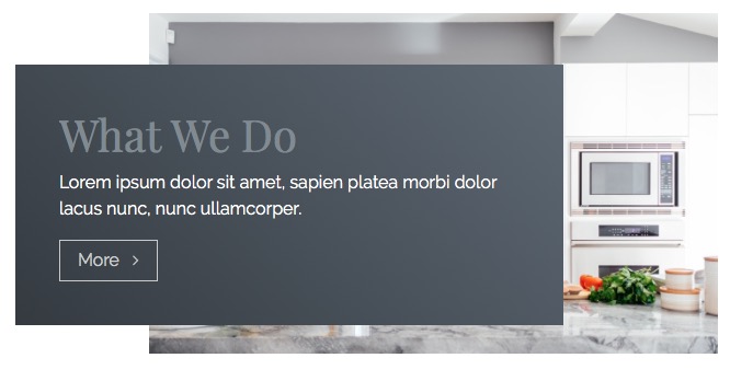
Interior design and particularly kitchen images often have a lot of white space, which is perfect for flowing the text over it, without the need to have a high contrast BG colour under it.
Hej Marten This is amazing nice design. Which stacks did you use for the overlapping?
Hey @Kent
I hesitate to even call it ‘overlapping’ because it’s more of an ‘undercutting’ the background. This is something you can do easily in any stack to which you can add a gradated background. In this instance I used BluePrint.
All you do is add the color/gradient child stack and set the angle to 90º and all the colour-stops to the same number — ie 40% or 33% or 60% — and then set one of the colours to white. See the settings below.

6 Likes
Perfect Thanks a lot :-)
That’s a really neat trick. Cheers!
1 Like
And to reverse it, simply change 90º to 270º (rather than change all three colour-stops.
1 Like
That’s very clever thinking. Bravo.
Works great with Billboard as well.
(And stolen…)
1 Like
Like early Modernism in the 60s, by the time this type of design / lifestyle / website becomes the subject of forums, or is on the street, those at the ‘top’ whatever that is , have already started to move on to the next ‘thing’ because it’s already considered, sold out. Brutalism was the cat walk of the web world and will filter through the layers of site design until it’s available in Primemark and Peacocks. I believe this style has been around for a few years now. As you write, theres already an ex hipster squatting somewhere drinking tea , cos coffee is so last decade, in the remnants of his hand made American work boots, creating the next big thing. That’s the guy we need to find.
and punch.
3 Likes
You say that now, but in May 2024 I bet it turns up here as a Web 6 post!
1 Like
How sure about that. It was the dodgy rat walk IMHO and started in 2014 or in RW terms, RW5.
Like many design / style / looks, designers and design plagurists cherry pick bits of it to create a “new” look. That look’s influence is quite widespread i woudl say.

Brutalism is to web design is what the Punk movement became, drawing on the commercial aspects of Punk. You could never sell a pair of piss and vomit soaked denim jeans to the market, but you could cherry pick the rips, holes and exposed zips, charge more money, and those influence are everywhere 40 years later.
2 Likes
Can’t really disagree - all edgy designers are copied and recycled aren’t they? It doesnt have to be liked , they are the influencers, like the source of the Nile. :)
I blame that Tav miscreant for daring to allow Weavers to even consider good design and provide us with tools, and just to rub it it all in, made them available for free, knowing that Weavers would not be able to resist. To seal the trap he created video, full documentation downloadable project files.
He can genuinely claim to have defined how we built web sites with Stacks 5 years ago and continue to do so. This was at the time when the hot selling stacks allowed you to create reflections underneath images, skeuomorphic items such as shelves and naff picture frames around images, gel buttons, whatever that weeks hot CodePen animation was, etc…
What was he thinking when he created stacks toolset to:
- Create Hero images
- Add animated icons at the bottom of Hero images to smooth scroll to the next section.
- MagicGellan dots at the side (let’s forget that one)
- Animated colour changing navigation bars.
- Overlaped content.
- Page dividers.
- Full feature typography for Headings and paragraph text.
- Web and local fonts including BASE64 fonts.
- Hero sliders.
- Centralised page settings
- Scaled text.
- SVG images and BG images.
- Animated content with BG image effects.
- Full featured buttons.
- Etc…
To cap it all off, his stuff has been copied many times over, by other devs and his influences are everywhere in the Stacks community.
All that skeuomorphic crap is making a return, so hang onto those old stacks. Who needs progress when we can just recycle the old crap.
4 Likes
Those are all very kind words but I am not going to let you off a title with 2.0 and 3.0 in it no matter what!
Dots at the side were the grid of their day.